Today we will further explore two of the elements that fascinate me most which are contrast and composition. I recently wrote about how to use at best of possibilities the contrast tool in photo editing.
You can consider this as a sequel to that article. The difference is that today we will deal with the use of contrast directly on the field.
If you haven’t read the first article yet, click on the photo now!
So, if you are more interested in how to use the contrast tool during photo editing and find out how this will affect your photos, don’t miss the previous article!
On this page, you will find some tips to use while out shooting. Are you ready to learn how to create the perfect shot using contrast and composition directly on the field?
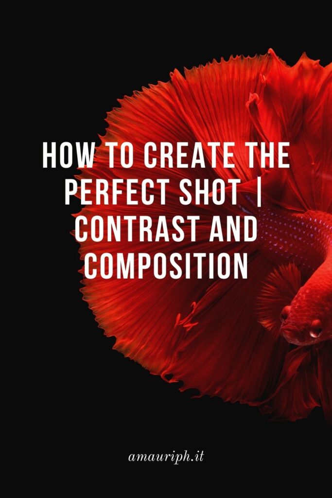
Learn to use contrast in composition

If you’re looking for a way to spice up your photographs, learning how to use contrast in your compositions is the easiest way to achieve this goal.
You will not always be able to rely on luck, sometimes you will have to look for the contrast or even create it. Don’t worry, I’m going to give you some tips with which you can start.
I’ll show you some examples to draw inspiration from and then we’ll look at some useful photographic techniques to create even more contrast. Are you ready?
Contrast in photography: some practical examples
Studying the work of other photographers is the way used by many to learn new techniques and new ways of shooting. However, remember that it is good to take a cue and be inspired by the work of another photographer, another thing is to shamelessly copy his work.
Always try to put your own into it. Your point of view is important and that is what will make unique your shot.
You can use contrast in several ways:
- The contrast between light and shadow
- Color blocking (contrast of colors)
- Geometric contrast
- Thematic contrast
These are just a few examples, but there are a lot more. Let’s see them together in more detail!
1. Take advantage of the contrast between light and shadow
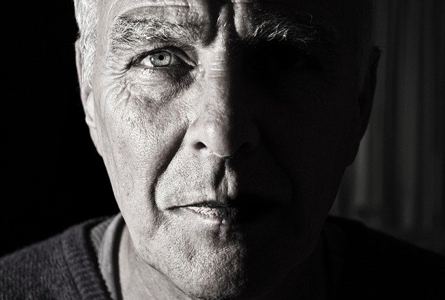
Probably the most common of all – and one of my favorite – is the contrast between light and shadow. Use what’s around you to create interesting shadows on your subject. You can use curtains, a pasta drainer, flowers…there’s no limit to what you can use! Just be creative.
Use an object with a particular texture, place it in front of your primary light source and that’s it! The aim in this case is to create optical games that make the image more interesting.
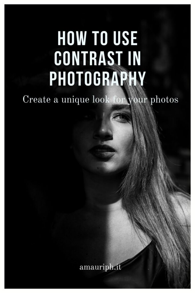
Another way to use light-shadow contrast is to give your subject more strength. It works very well in portrait photography. In this case, make sure you have one side that is much brighter than the other. You can also adjust the contrast in post-production, so it doesn’t have to be perfect right away.
Try different apertures and different shutter speeds to find the ideal combination for you.
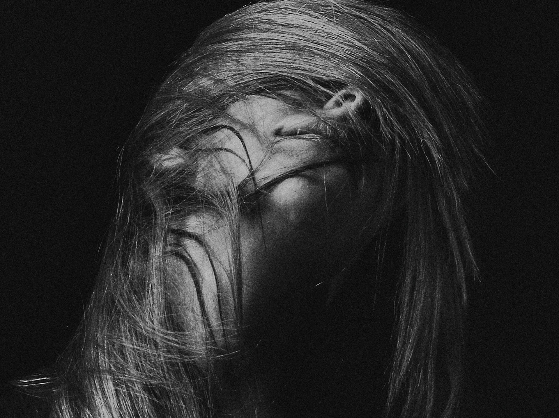
It all depends on the final effect you want to achieve. Whether it’s more artistic or more dramatic. Here are some practical examples of using the contrast between light and shadow.
Artistic Effect
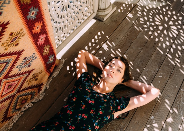
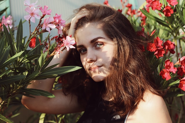
Photo by Sergei Gavrilov, Barbora Polednová on Unsplash
Drammatic Effect
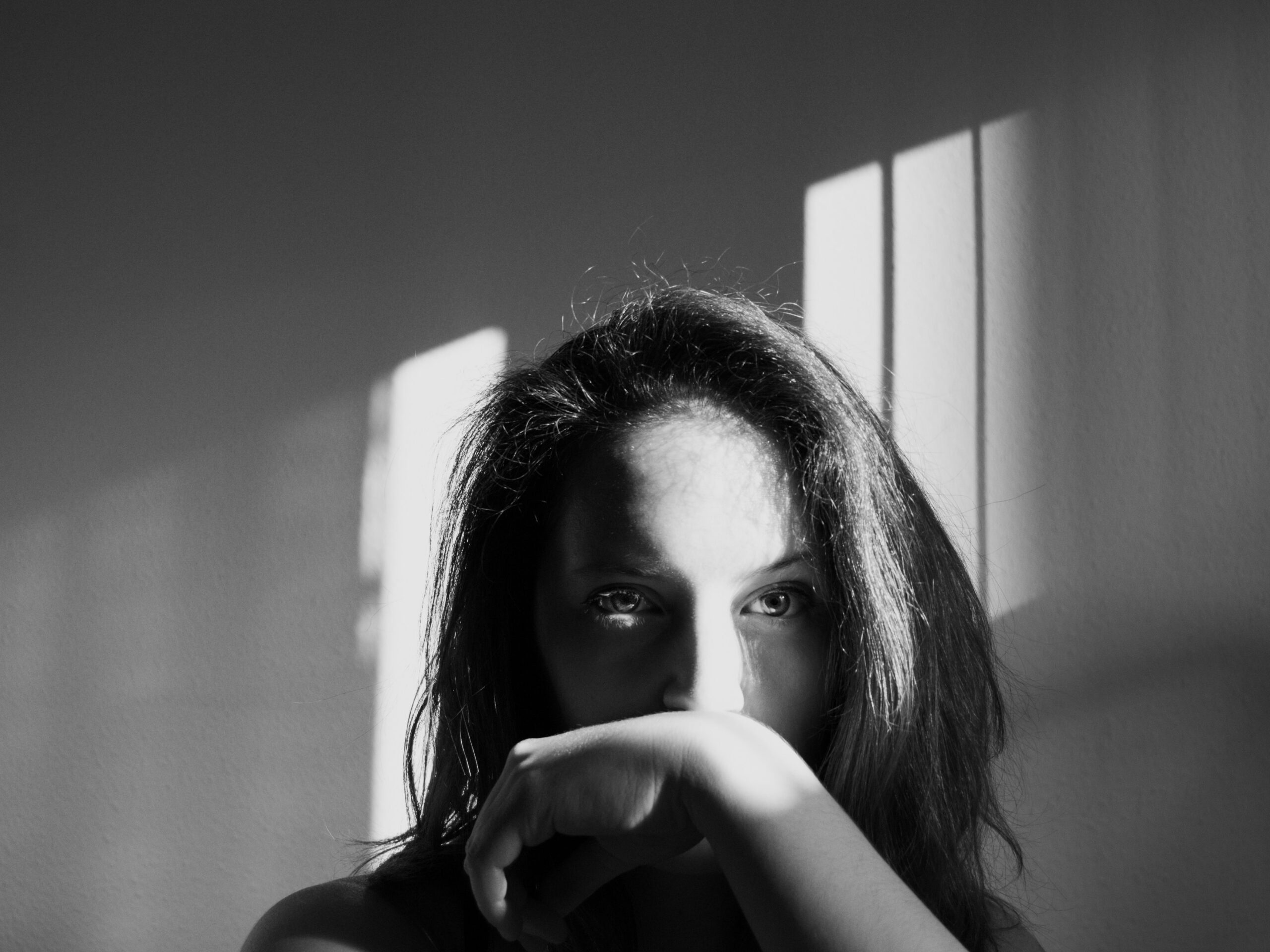
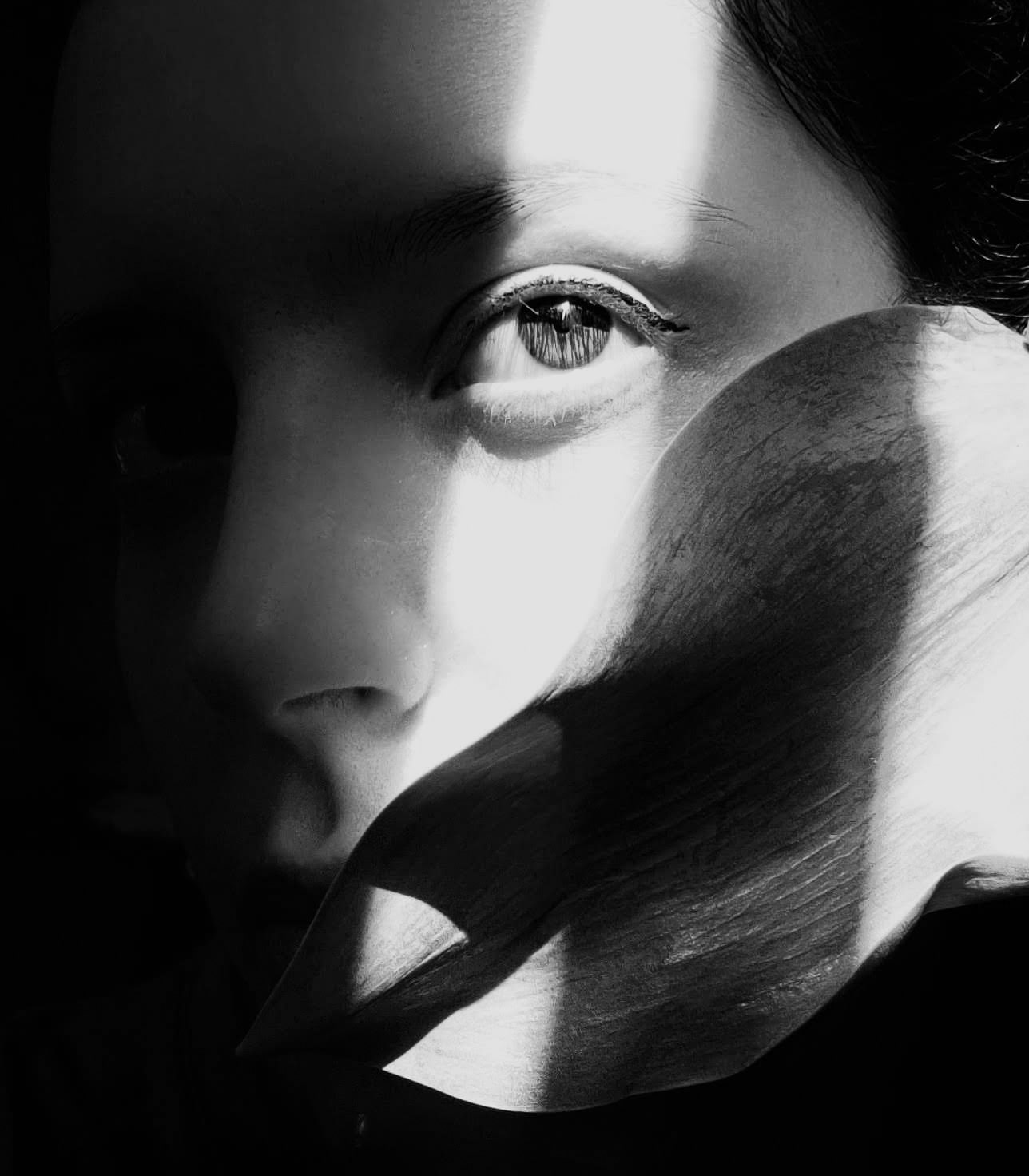
2. Color blocking: the contrast between colors
This type of contrast is found everywhere, even in the fashion world. What am I referring to? Let me introduce you to the combination of complementary colors.
To give you a better idea, you can spot complementary colors by looking at a color wheel. We call complementaries all the opposite colors on the spectrum.
So red-green, blue-orange, purple-yellow, and so on.

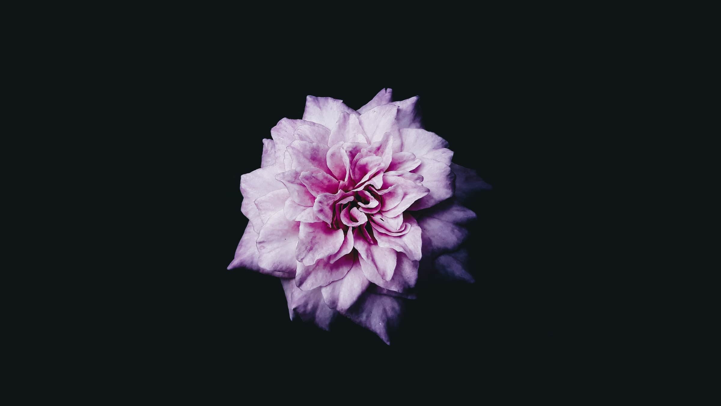
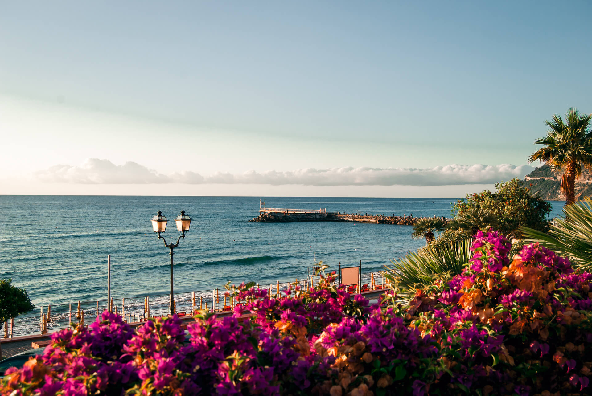
In photography, the contrast obtained with complementary colors can be more or less evident. If we are talking about product photography or advertising, it is common to use full and vivid colors – like in the photos below – to accentuate the subject.
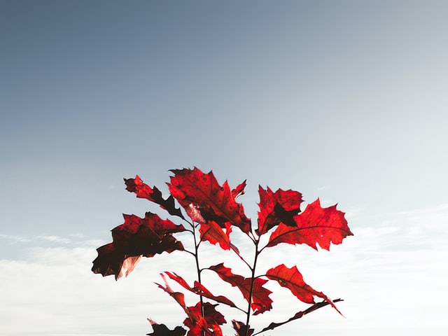
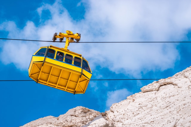
Using this strong color blocking could be very effective, but be careful to adapt it to every situation you find yourself in. Not every subject is suitable for this kind of color contrast. In an everyday situation, one of my favorite things to do is, while walking on the street, pay attention to the doors and wall’s colors. You can find some very picturesque combinations.
Another example, if you are hiking, try to pay attention to the color of the flowers and the background in which they are located. Vivid colors stand out a lot more within a darker context.
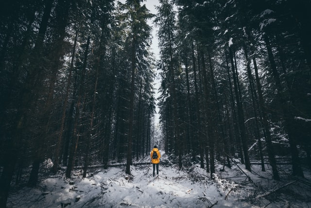
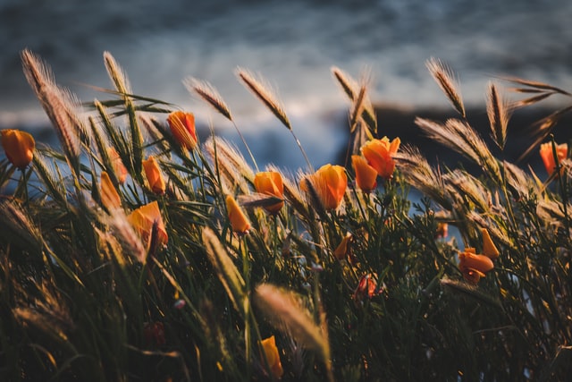
Taking advantage of color contrast will make your subject stand out.
A little disclaimer. Often you will find photos like these two that I’ve included. Those colors are probably being manipulated with some editing techniques. So don’t expect to obtain the same type of result right away.
But hey, editing is another important step in photography and is the key tool to create amazing shots. So don’t judge it too harshly and remember: you can be a magician of photo editing, but if the image you’re trying to edit has a bad composition, bad exposure, or bad contrast, you will never get the perfect shot you had in mind.
3. Taking pictures using the geometric contrast
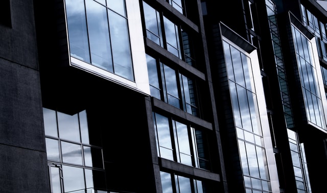
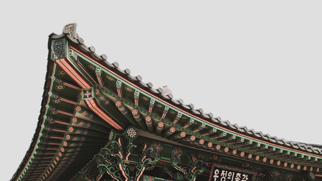
When you want to photograph a building or any architecture try to find the geometric contrast. Everyone knows how to capture a building, but a photographer can add something special, don’t you think?
Look for the contrast in the shapes in front of you. Intersecting lines and lights that reflect on surfaces create new shapes and different angles that do justice to the architectural immensity.
This way you don’t have to have a wide-angle lens, which is usually essential for photographing buildings. And you will also be able to capture the essence of construction through details.
4. Thematic Contrast
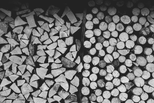
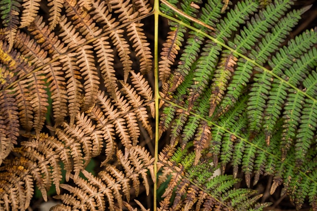
We can define this contrast as abstract. The photographs that best exploit the thematic contrast are reportage or travel photos. I’m referring to showing the two sides of the same coin.
Wealth and poverty, nature and pollution… You name it.
I believe that taking photographs of this type is one of the biggest challenges a photographer can face. When you find the right shot, the result is almost always incredible.
An easier way to apply this kind of contrast is to simply look for nearby opposites.
Conclusion
All these types of contrast are of no use by themselves. If you want to use contrast, the composition has to be your second thought, always.
Composition is the final touch that allows you to make your photo perfect. Excellent use of symmetry in the case of shadows and colors.
The use of negative space is also good (leave most of the photo “empty” and position the subject in a corner. NB. Does not always work with all subjects).
Experiment and don’t be afraid to crop/cut your images during photo editing. Often a well-executed crop can only benefit a photo.
I hope as always to have helped you! See you next time!
